Brand Identity
This educational and artistic project called El Recreo (the recess) was introduced to engage kids in activities during the lockdowns and later openings from the Covid-19 pandemic.
The aim was to create both on-site and remote experiences to keep kids connecting among them, exploring their creativity, and enganging socially to make up for so much time in isolation.
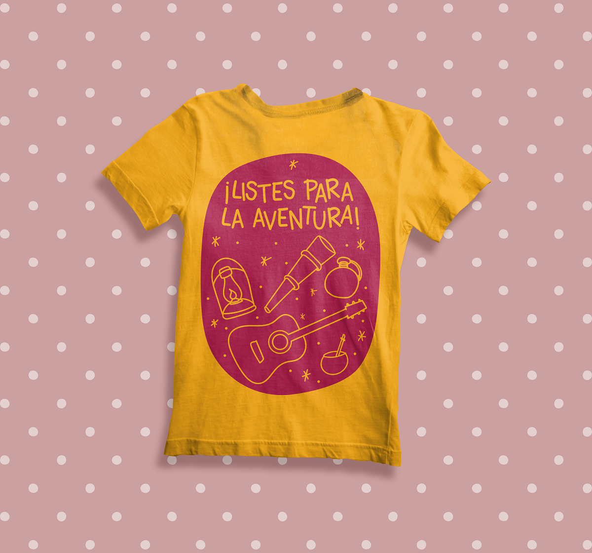
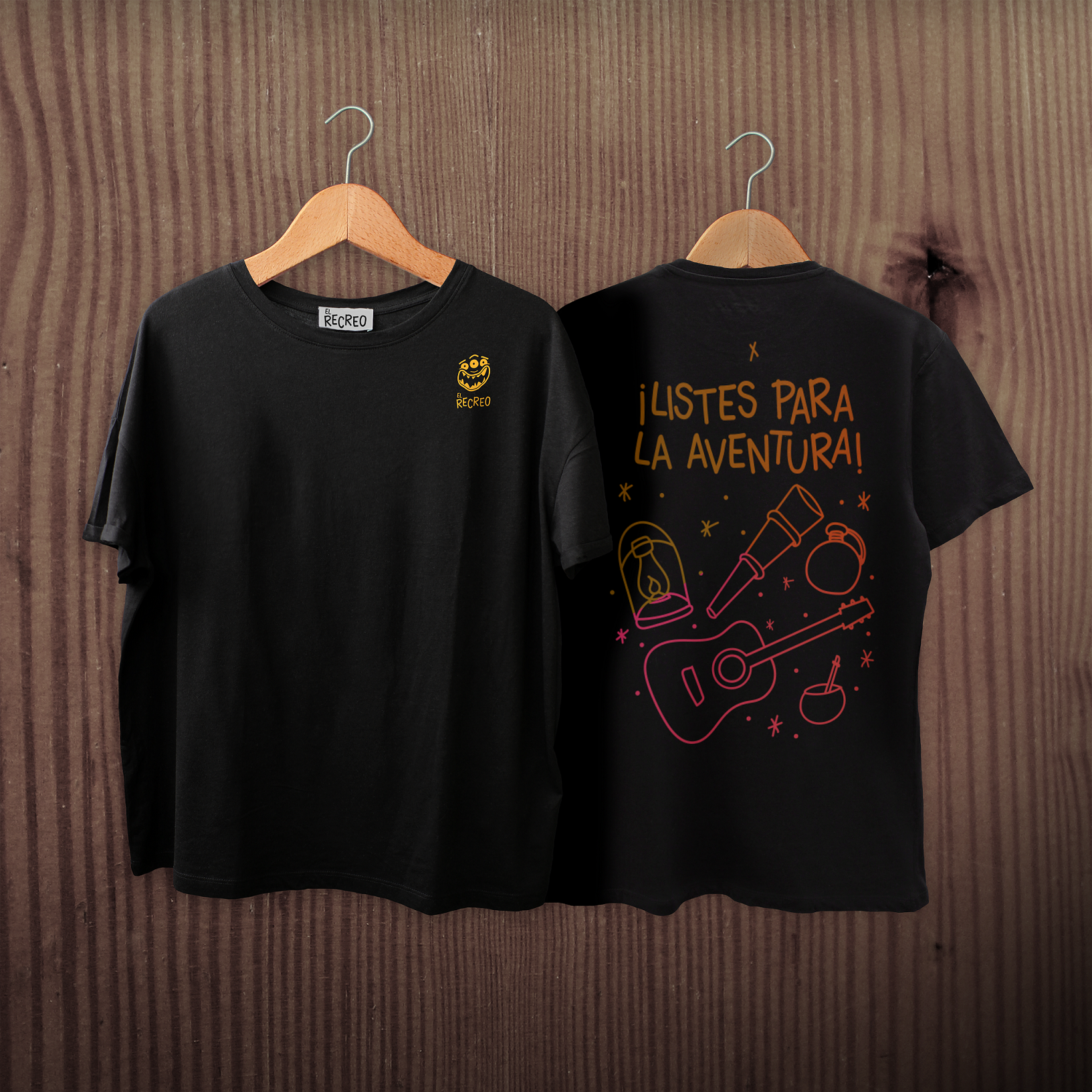
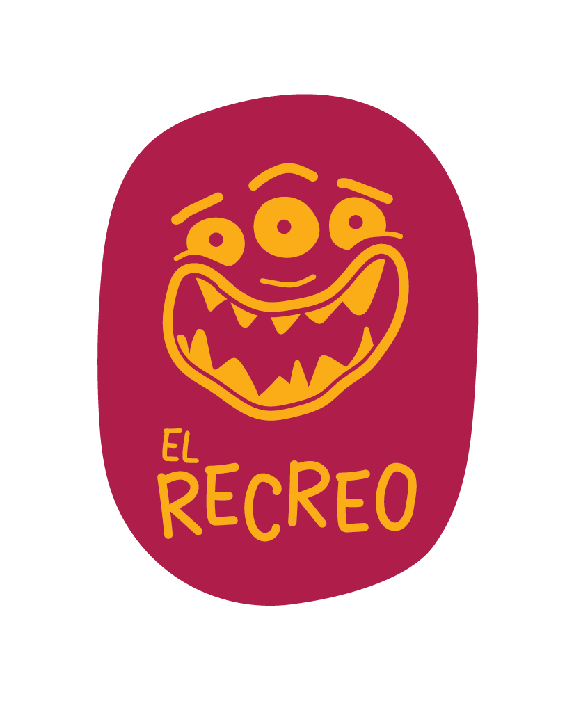
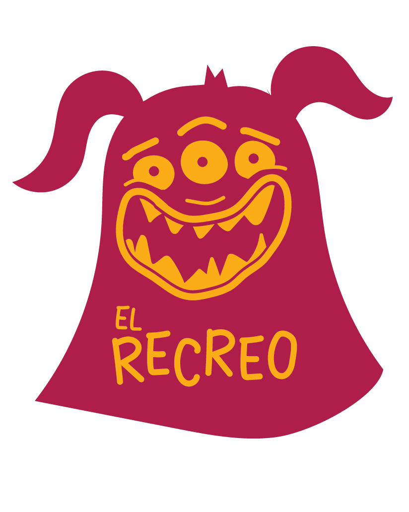
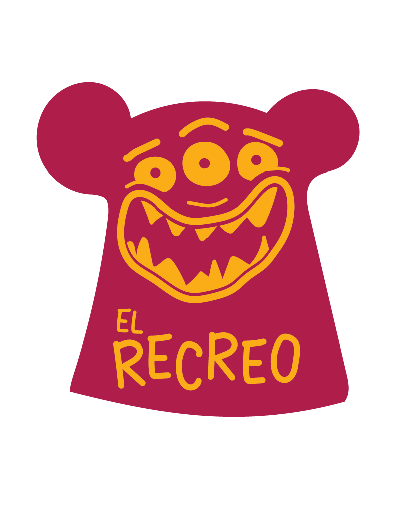
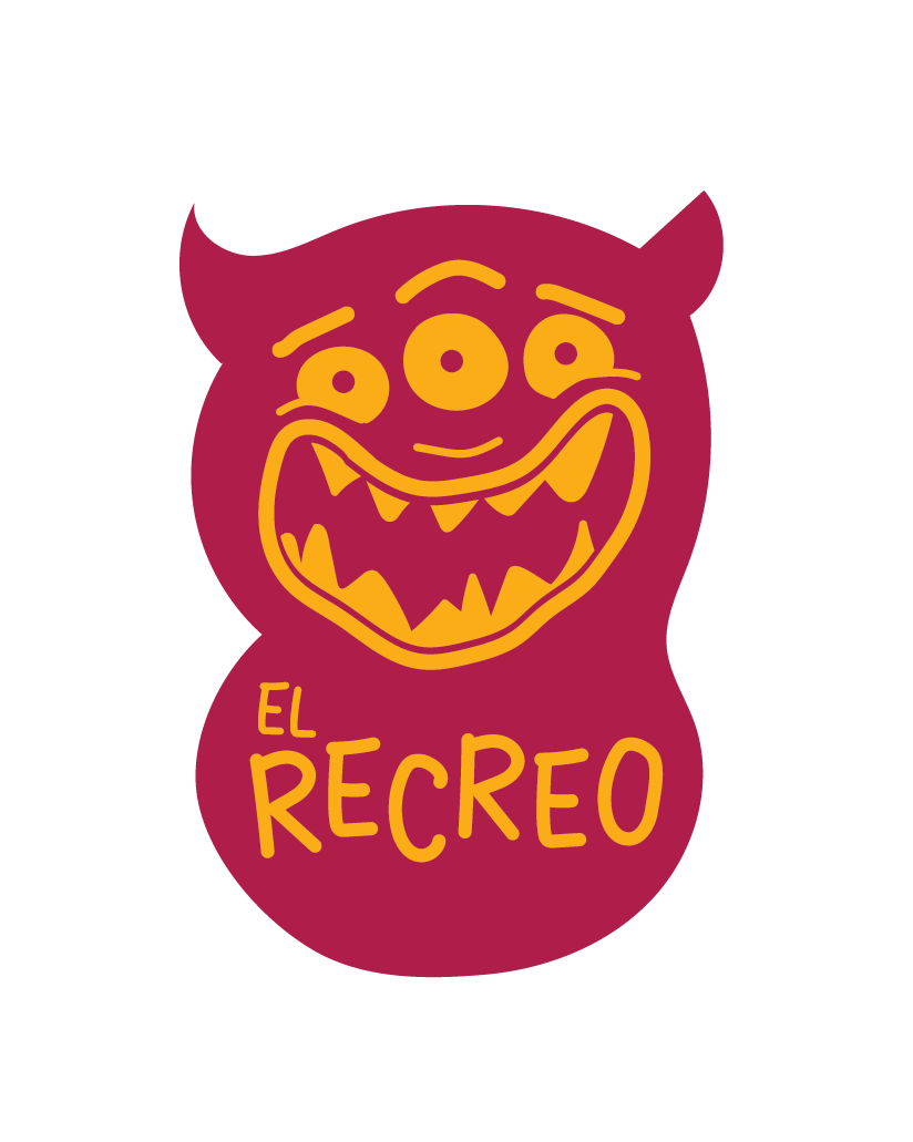
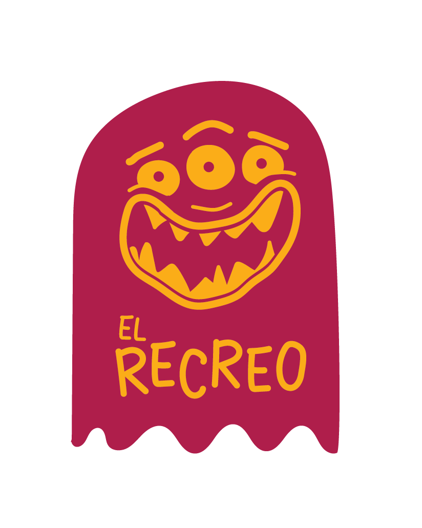
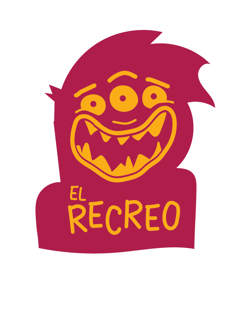
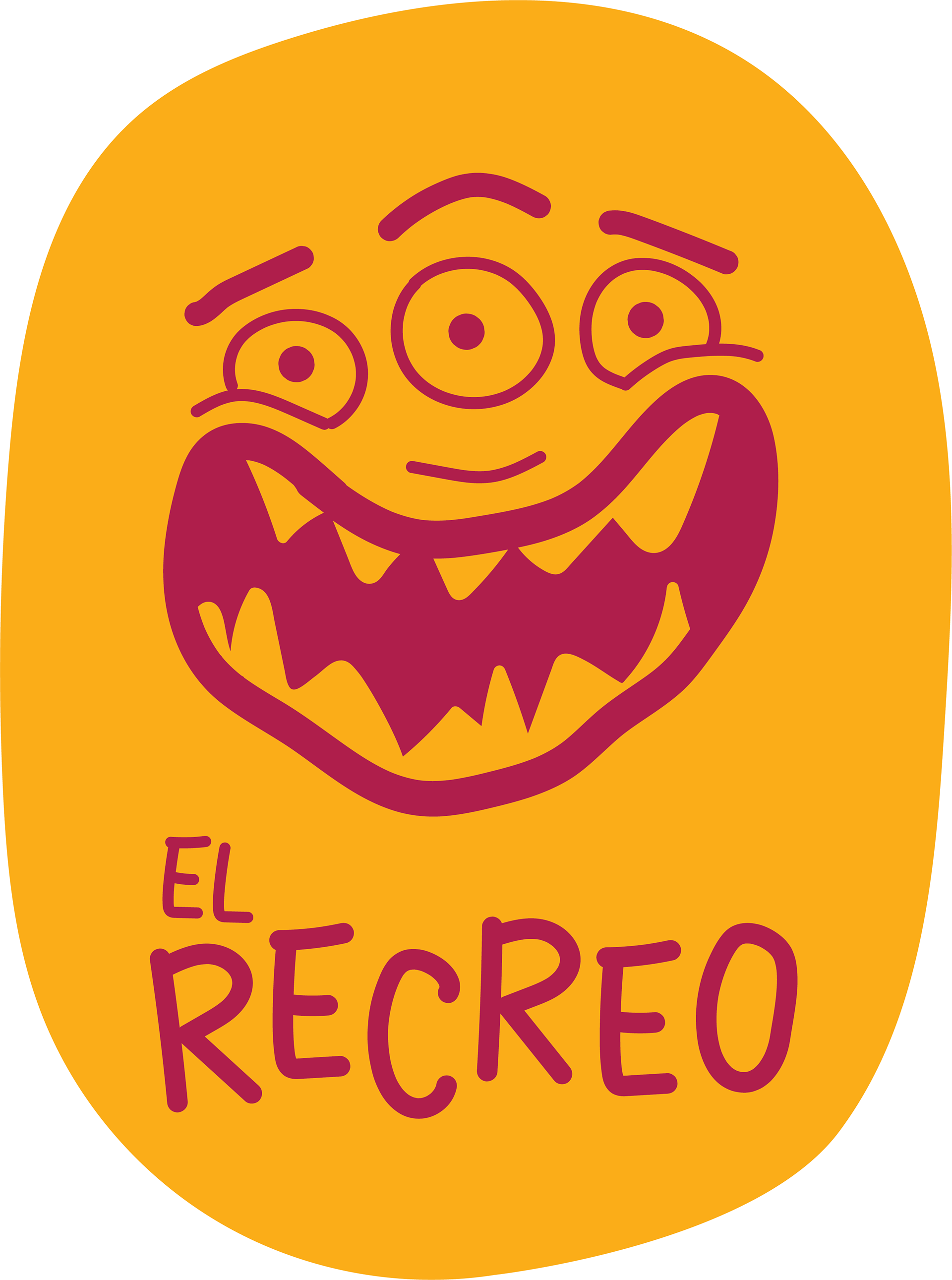
For the name we created a logotype completely from scratch, handmade to give a childlike appearence, and all in caps so it would be easy to read.
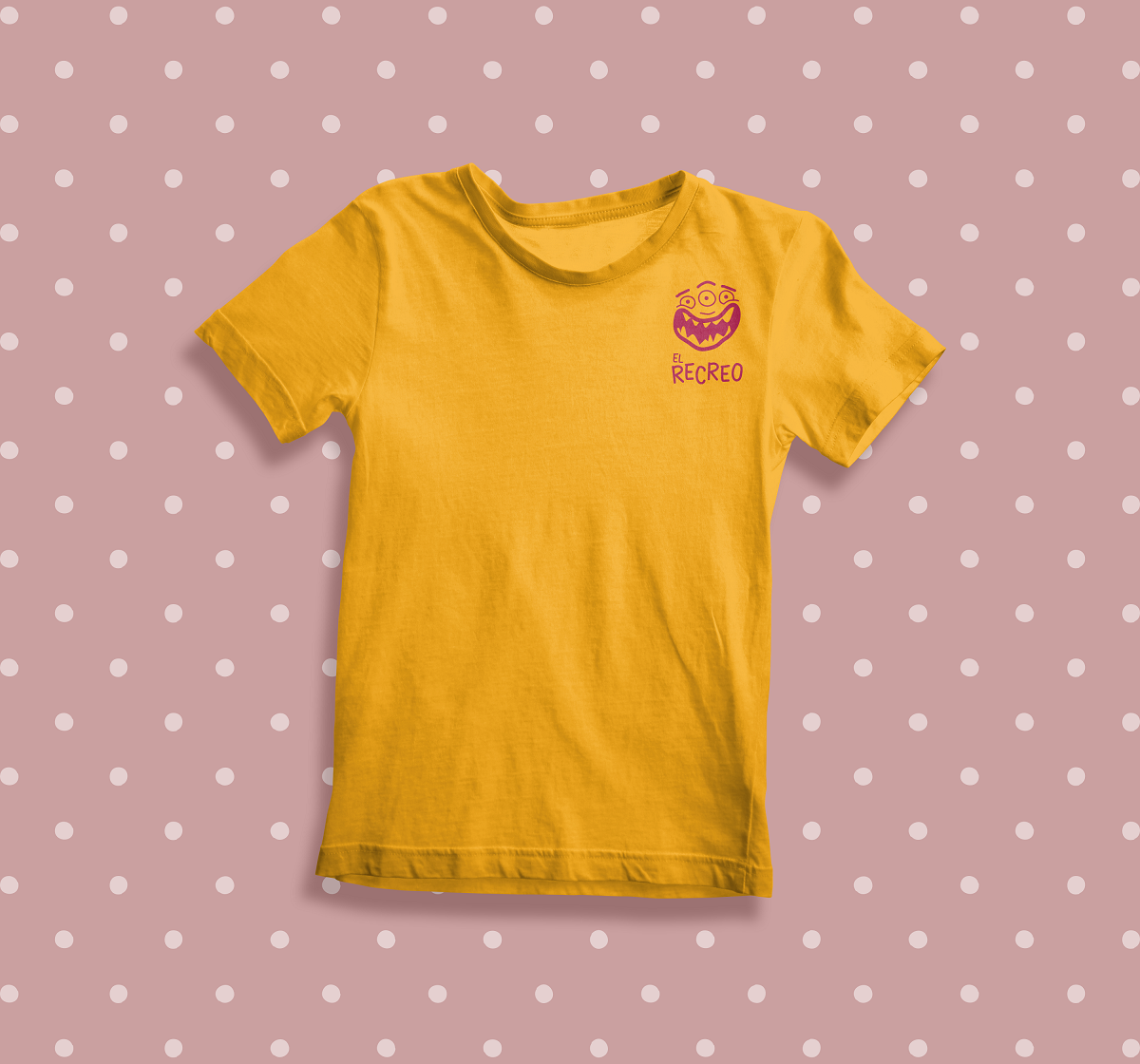
We also decided to create a mascot, since kids really like meeting new characters that they can identify, laught at, etc.
Becuase of the rebellious nature of recesses, and the spirit of the project which proposed rengaging with the freedom of being a kid, and the liberty of experiencing life in the most out-of-the-box ways, we decided to create a litte fiendly monster:
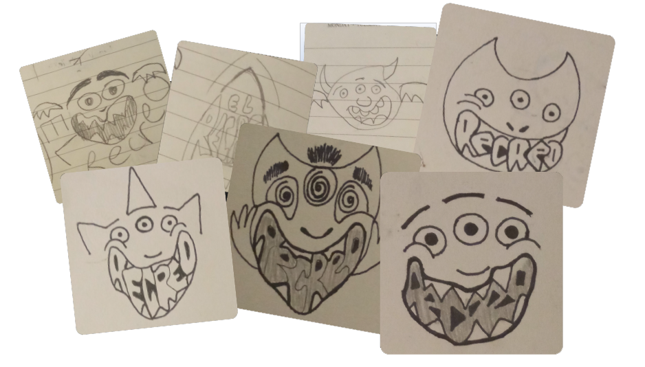

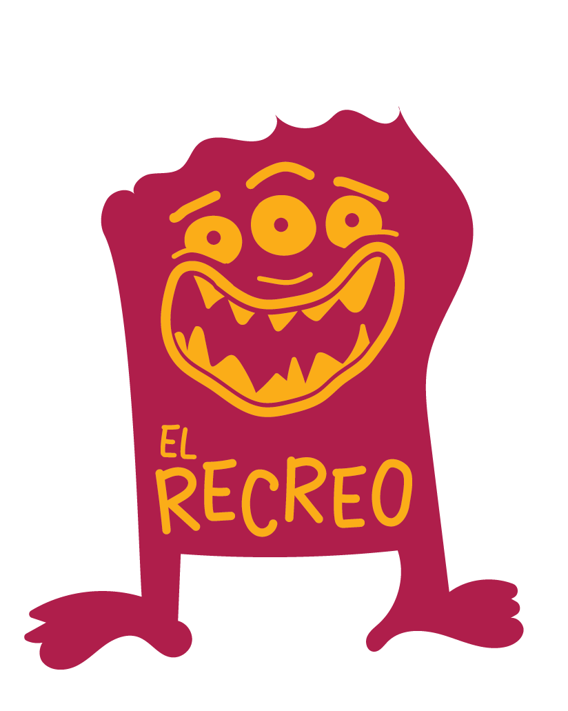
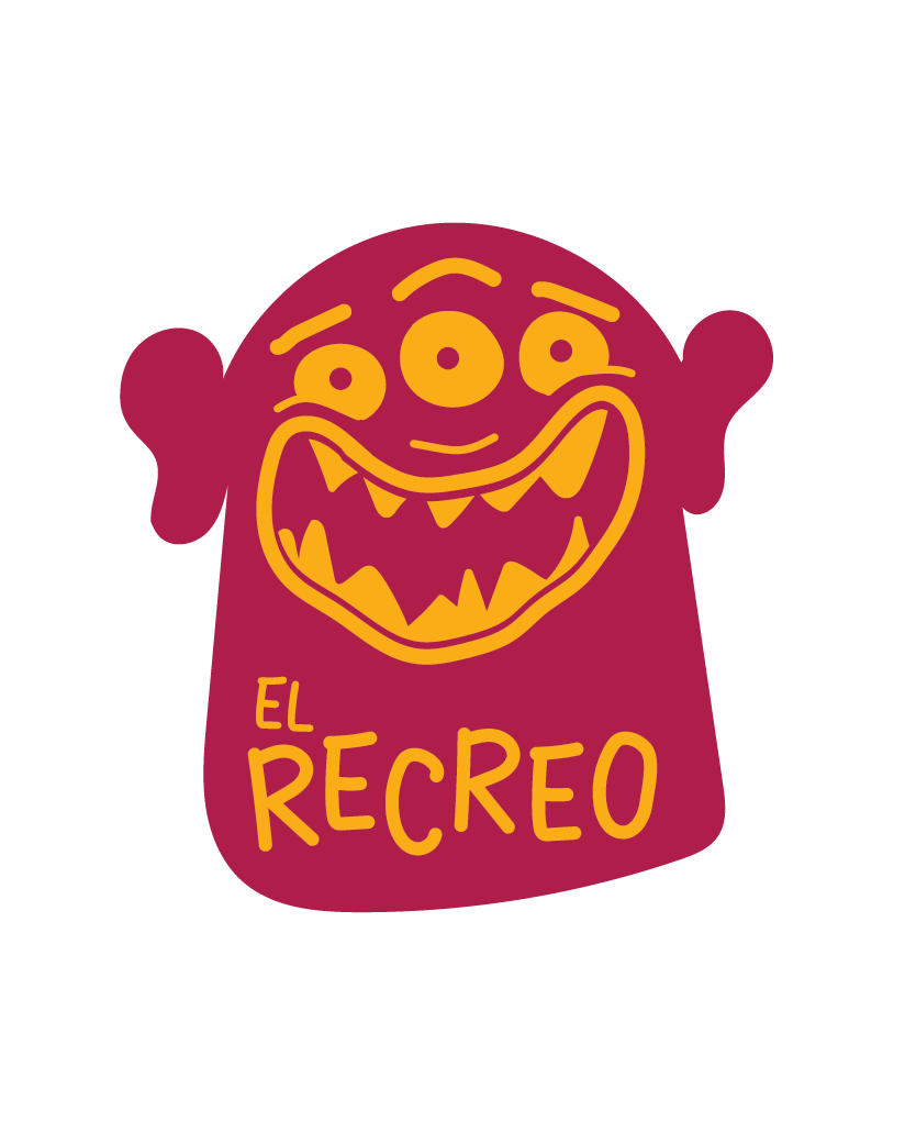
We wanted to showcase the level of interactivity this character could have to further engage kids, so we proposed an idea to keep the face while proposing kids to draw the headshape and body of the monster.
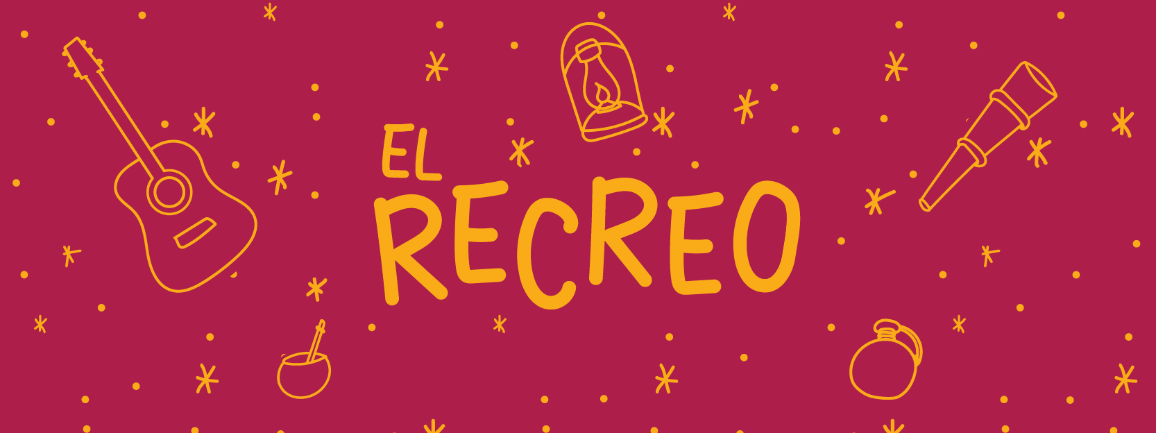
We created an animated version of the logo to grab kids' attention and to use as intros for El Recreo's videos in interactive experiences.