An artistic project made by and for women who are starting a new era of life; their kids have grown, they are single, and they are having a great time exploring their new found freedom and having fun.
Brand Identity
Mujeres sin Regla is a trio of actresses that started making sketch comedy videos about their everyday life as single women living alone as their children have grown up. They laugh about the new activities they get involved in, their struggles, and adventures.
The trio started making video content for YouTube and Instagram, and later moved to live shows touring across Ecuador. They want to expand to creating a clothing line and other products in the future.
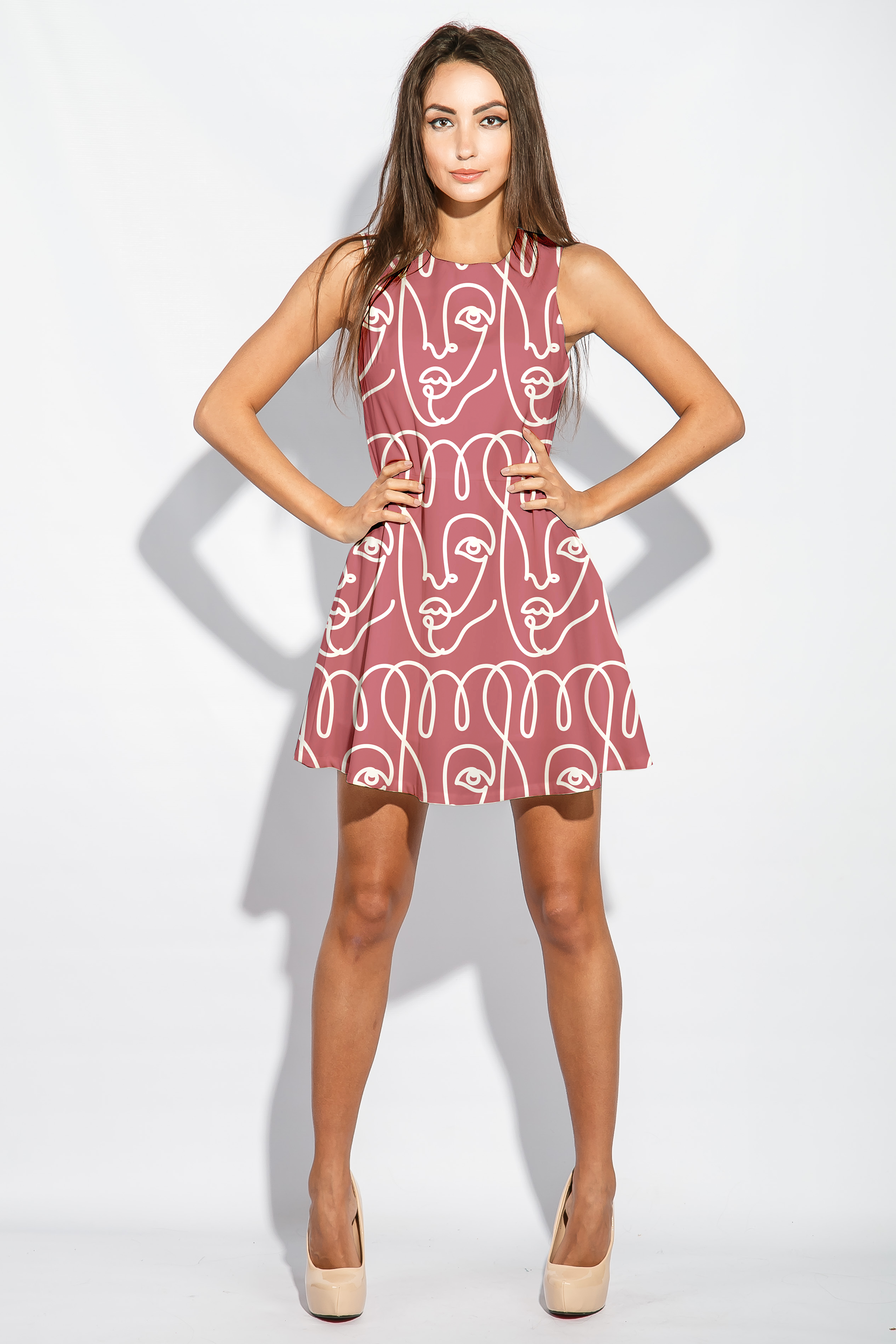
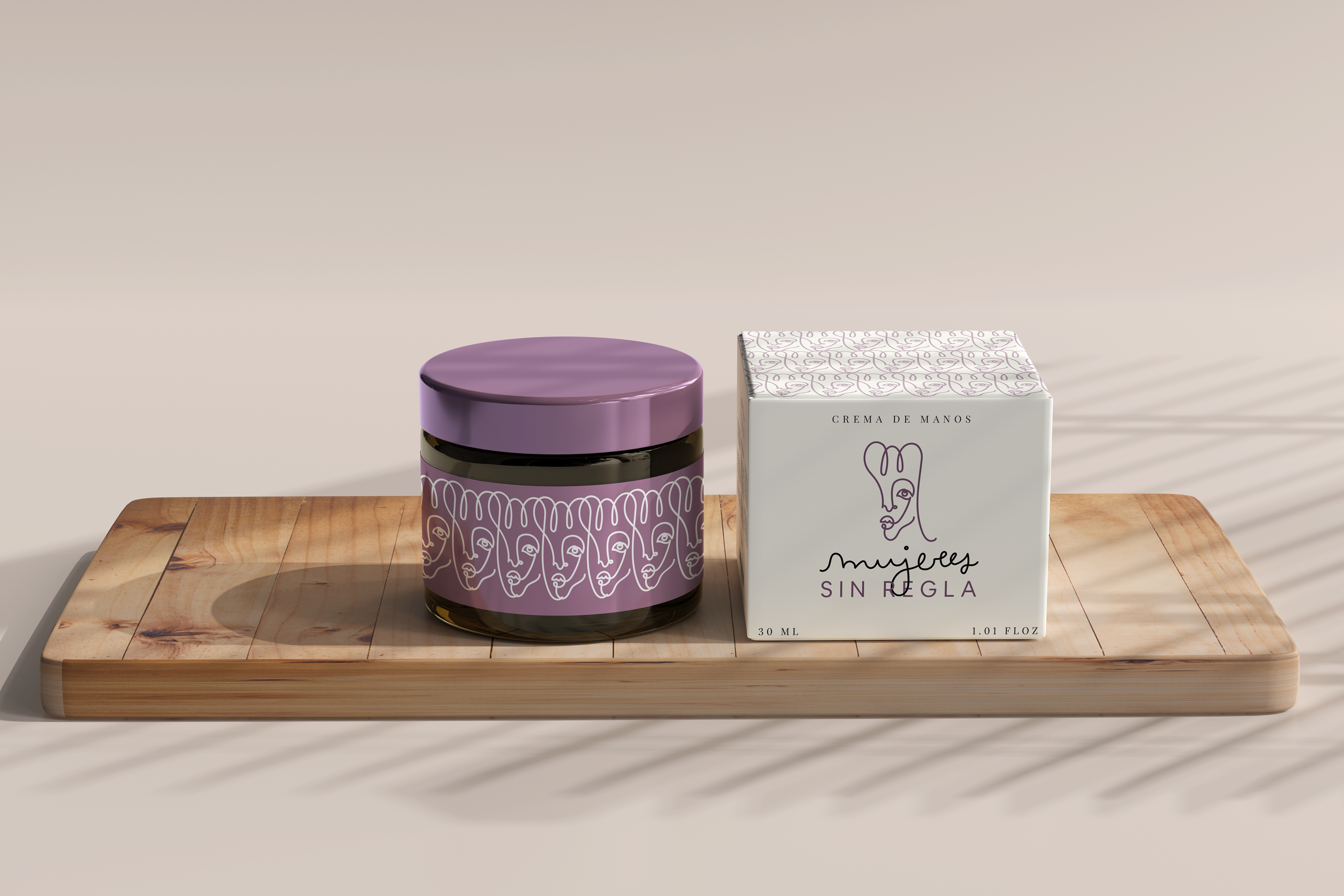
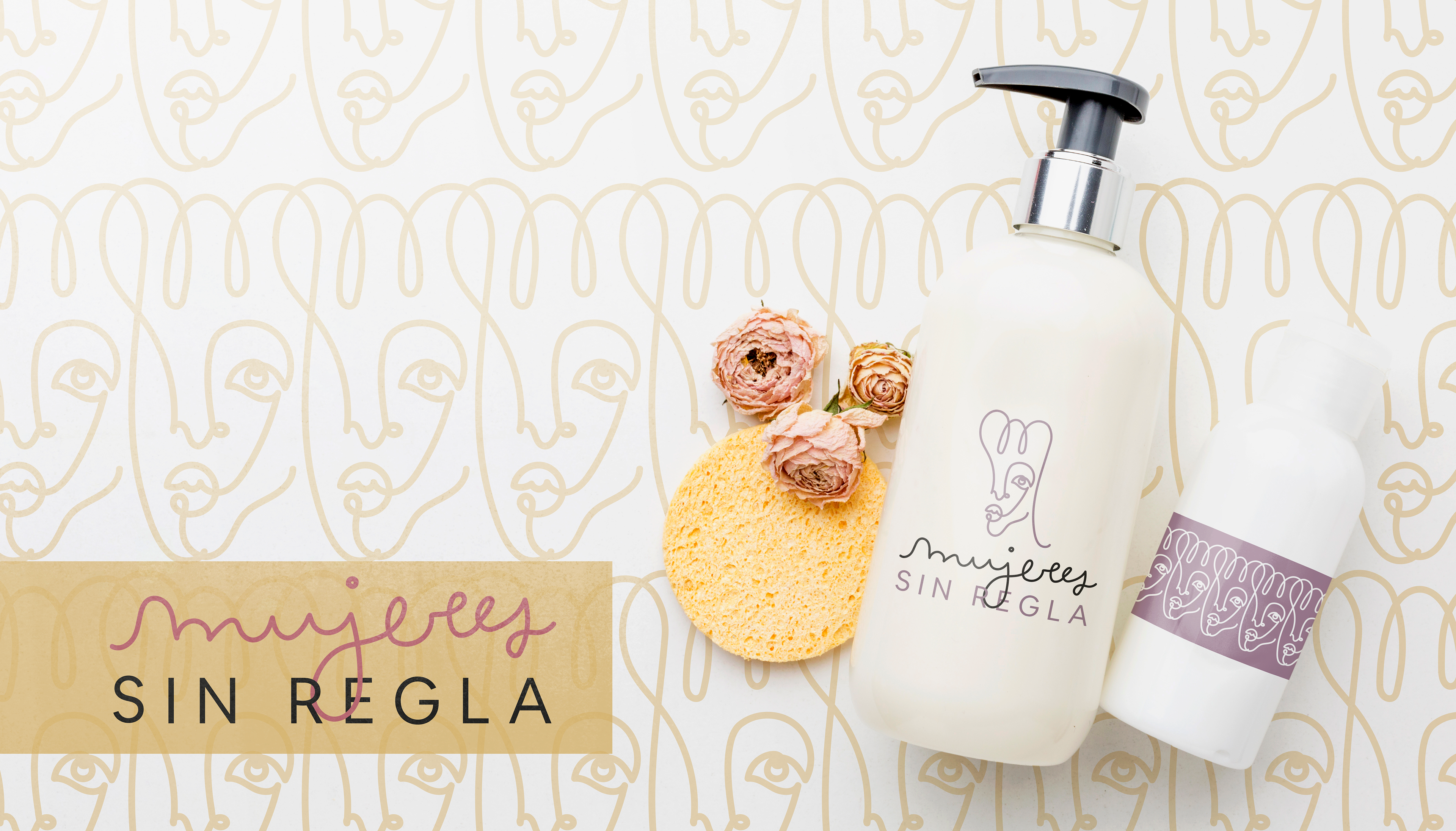
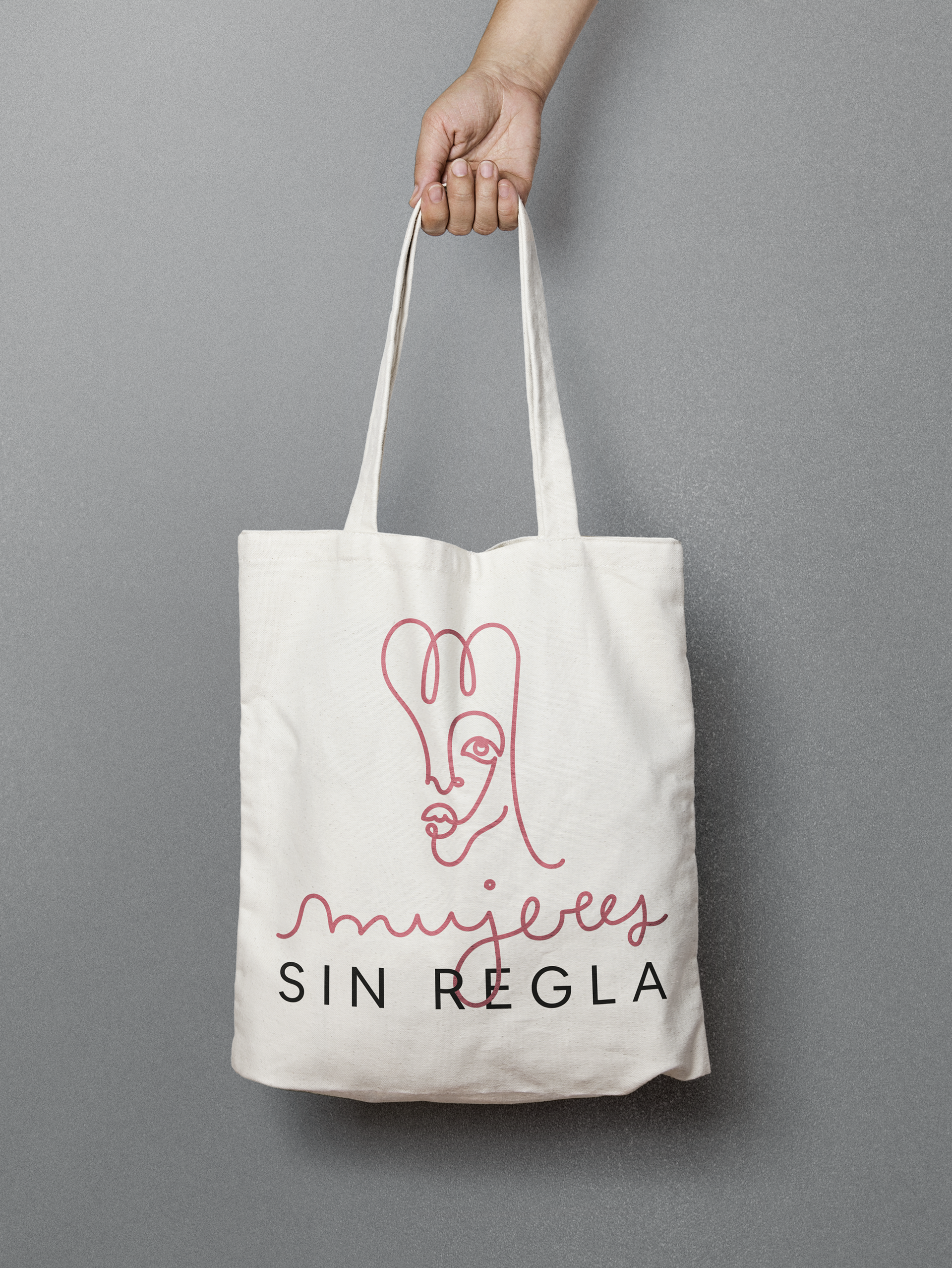
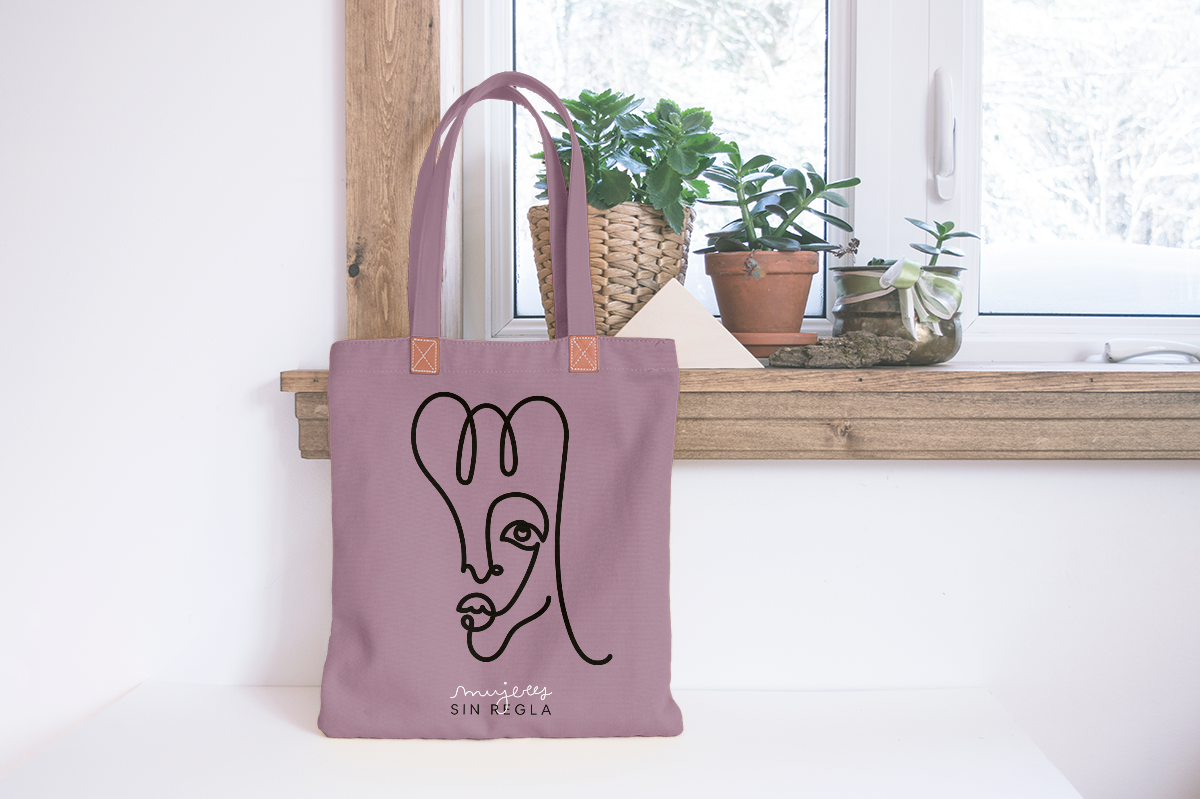
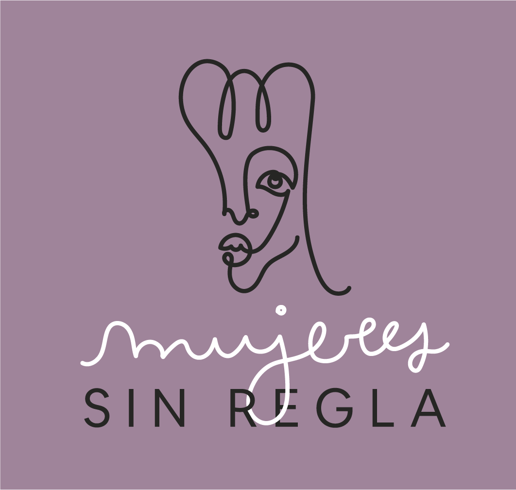
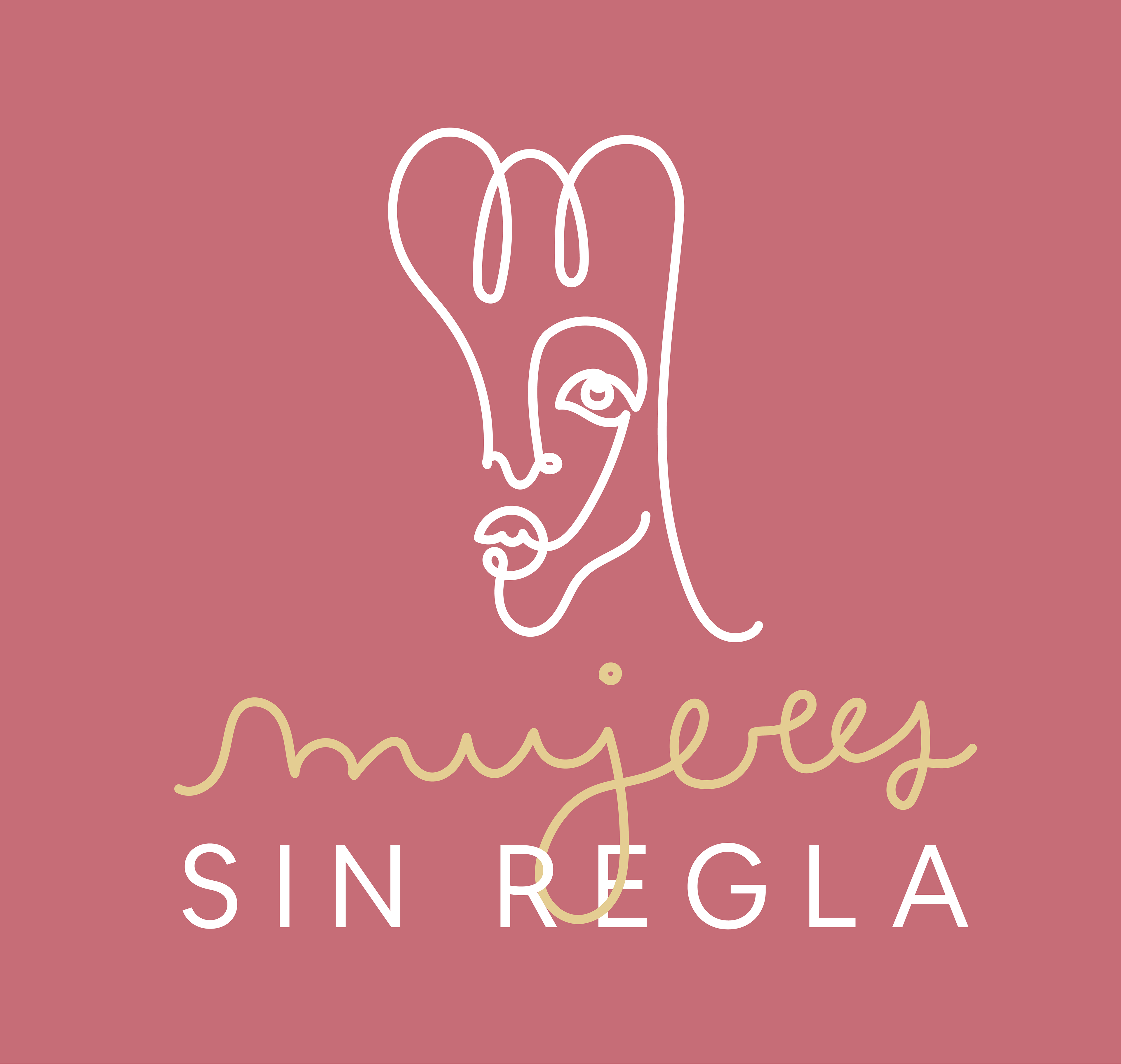
The name of the project has a funny double meaning. Mujeres is women, and sin regla stands both for following no rules, and for not longer having a period. The name immediately sets the funny tone for the trio, and they wanted the logo to counterbalance the comedy and the femenine focus of the project with a classy tone that could be usable in products with minimalistic and elegant packaging.

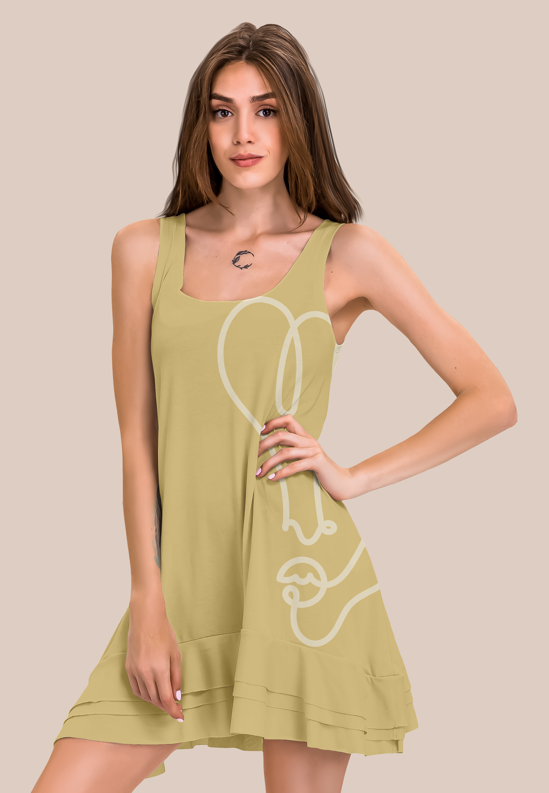
For the logo, we focused on their request to have a femenine, soft and flowy image that would show women empowerment at any age.
They wanted to showcase in their sketches how women should unite to review and reflect on beauty standards and how those are transformed depending on what you value in life.
The one line drawing for the logomark comes from this idea of union, and also of a lifepath that can be wobbly at times but in the end forms the beautiful picture of who you are as a woman.
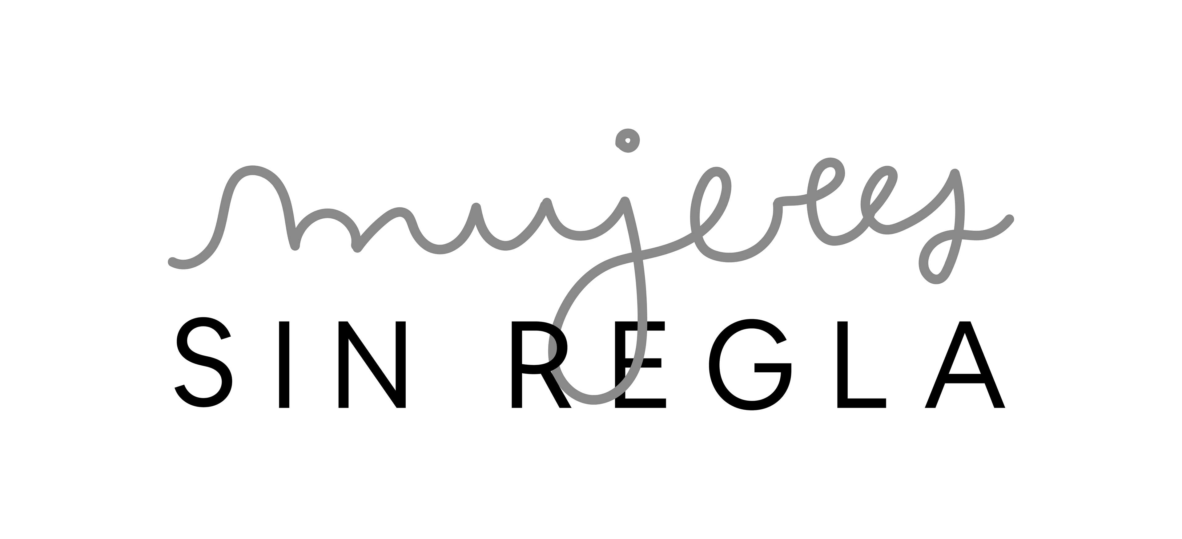
We designed the logotype to continue with this one line feel, and created a custom font for the name. To show contrast, we write the second part of the name with Made Evolve Sans, a geometric font that highlights the femenine nature in the word mujeres.

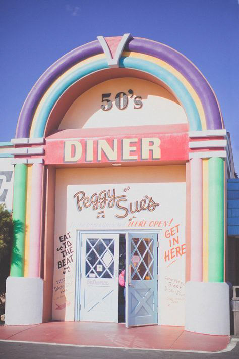
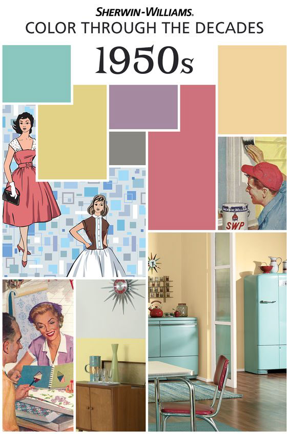
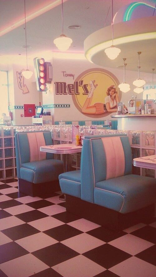
For the color palette, we grabbed inspiration from the 50’s aesthetic, and modernized a bit to fit the minimalistic logo.
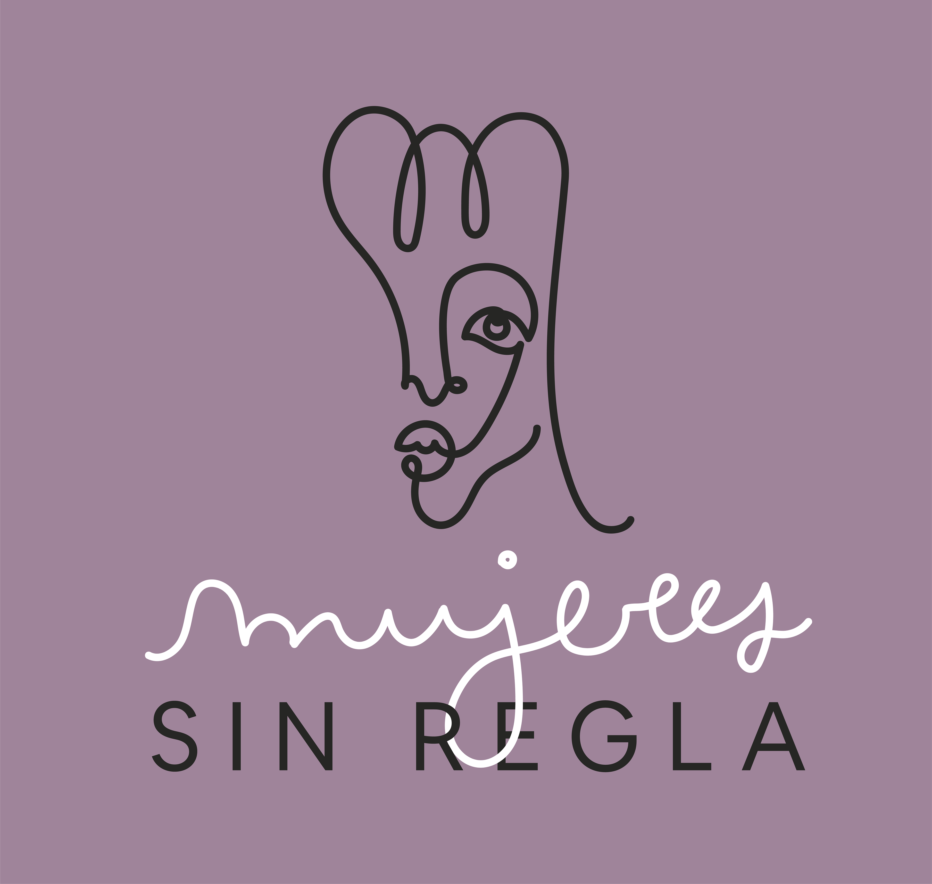
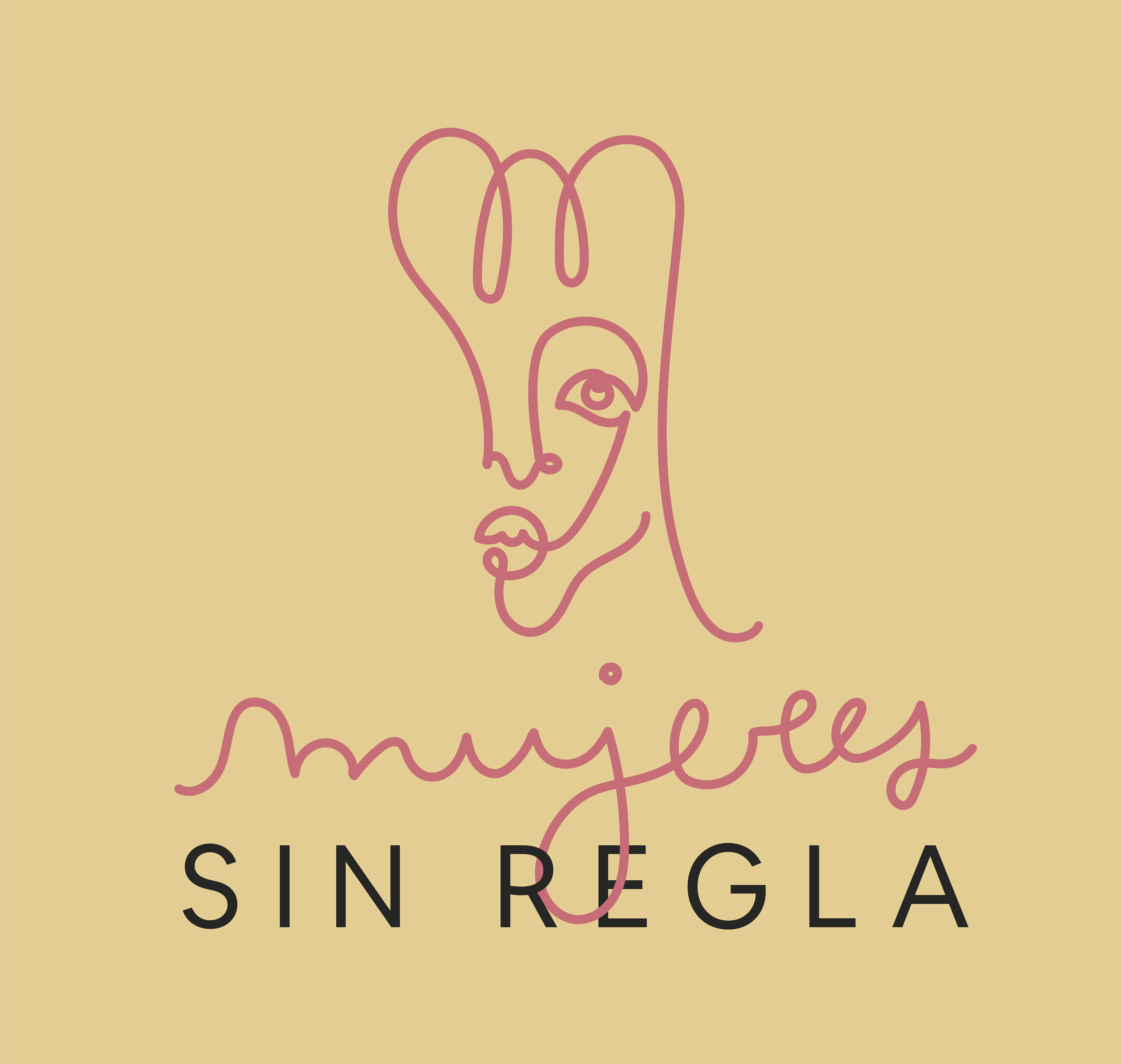
Applications