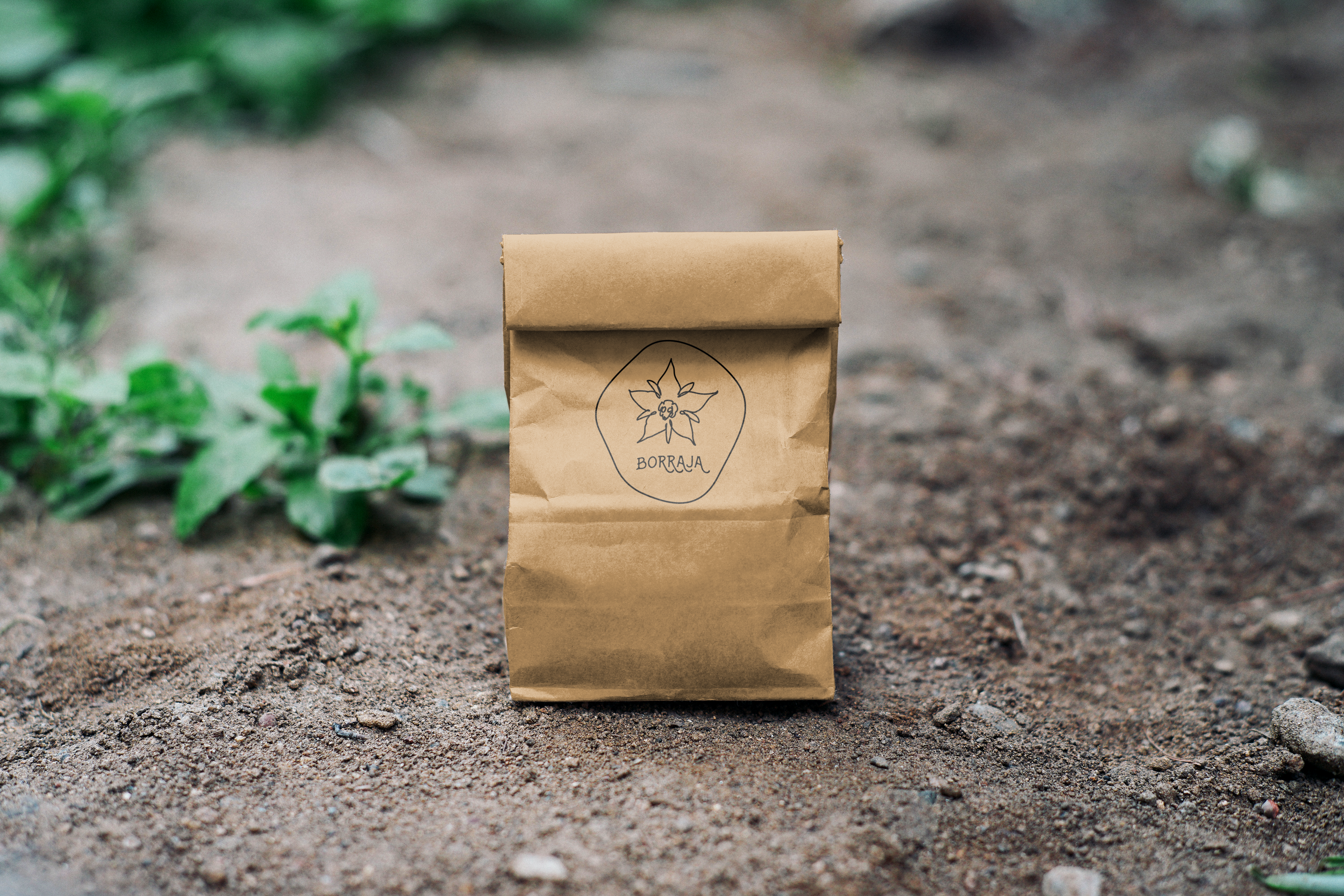
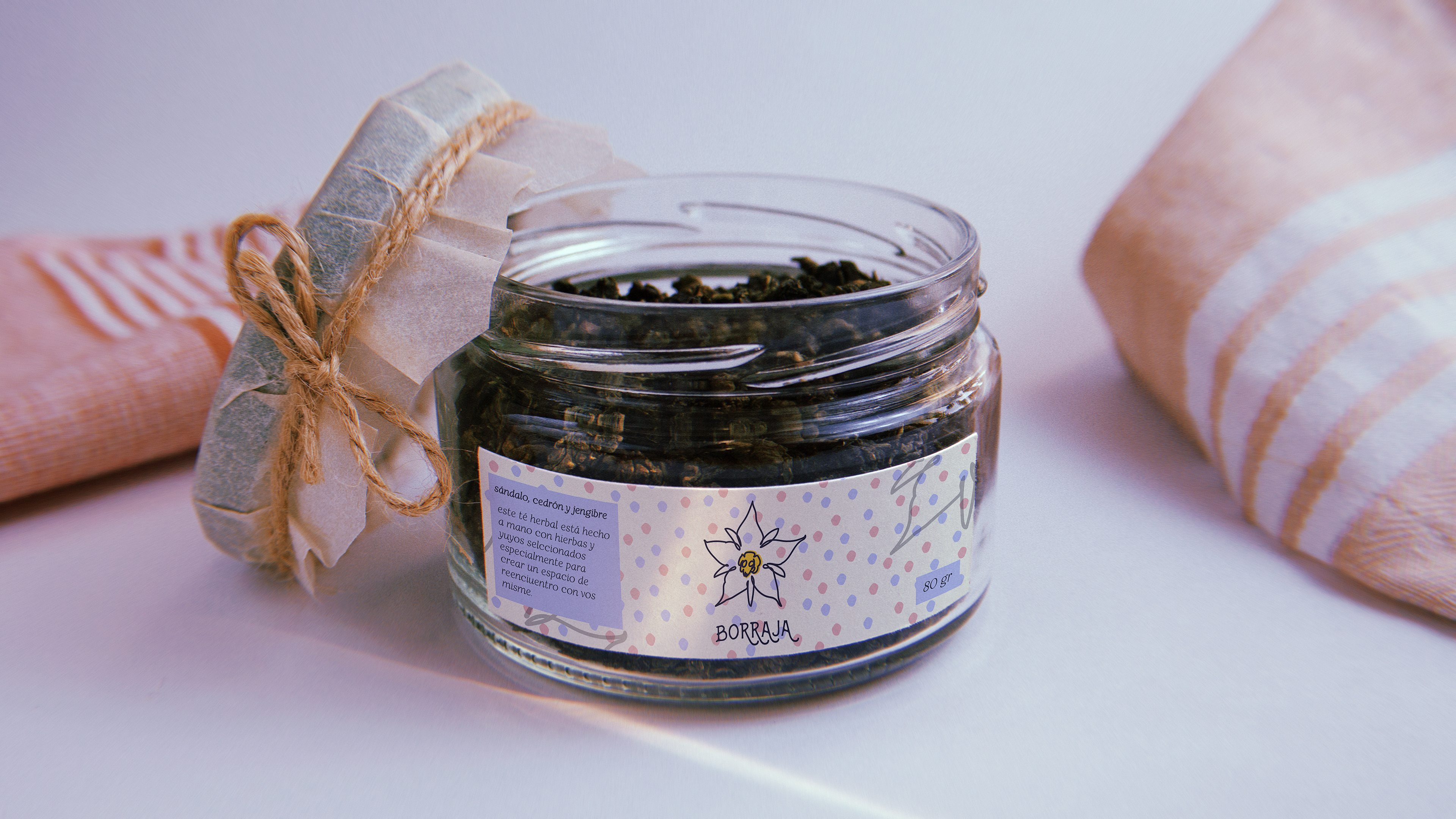
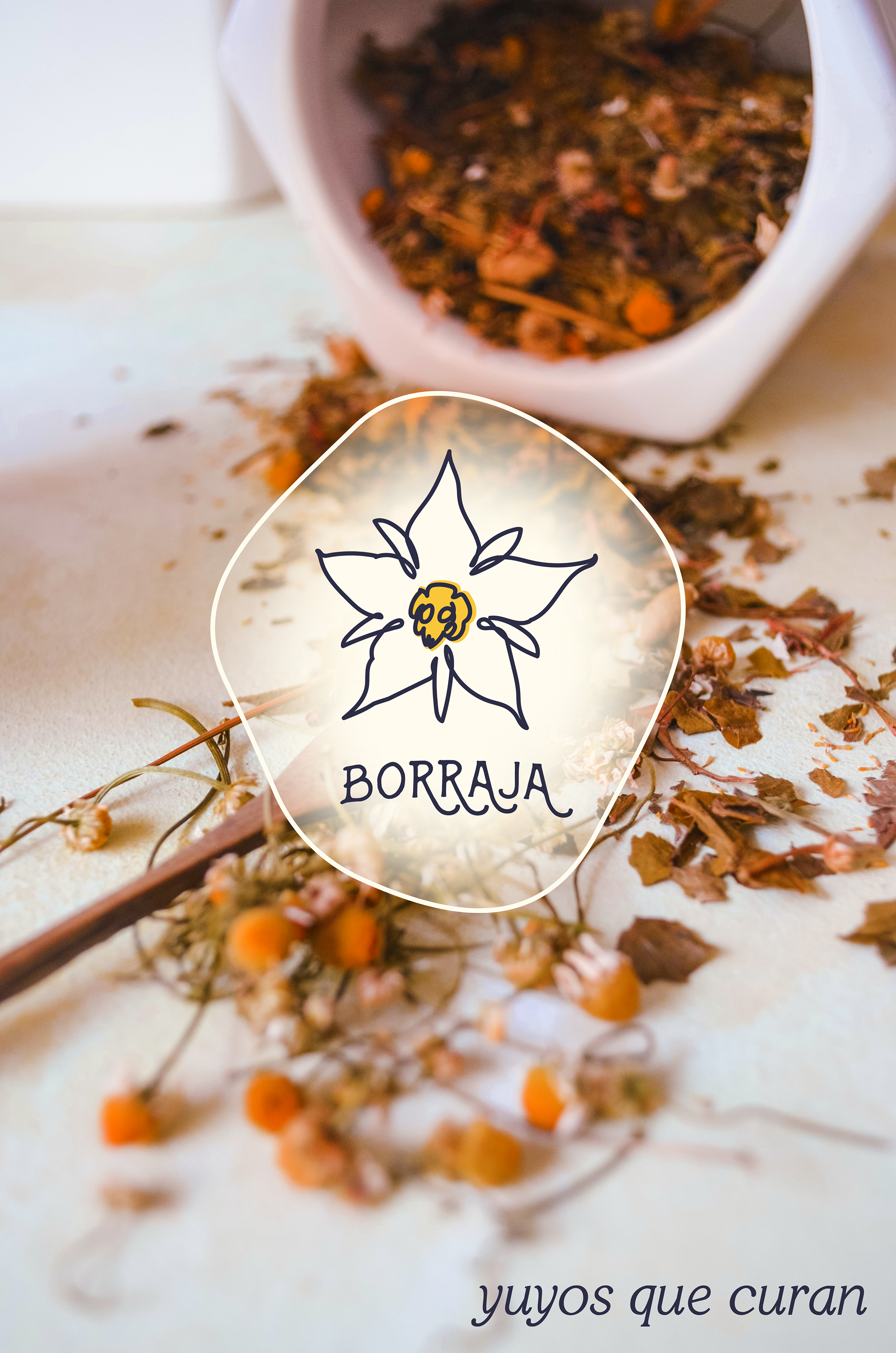
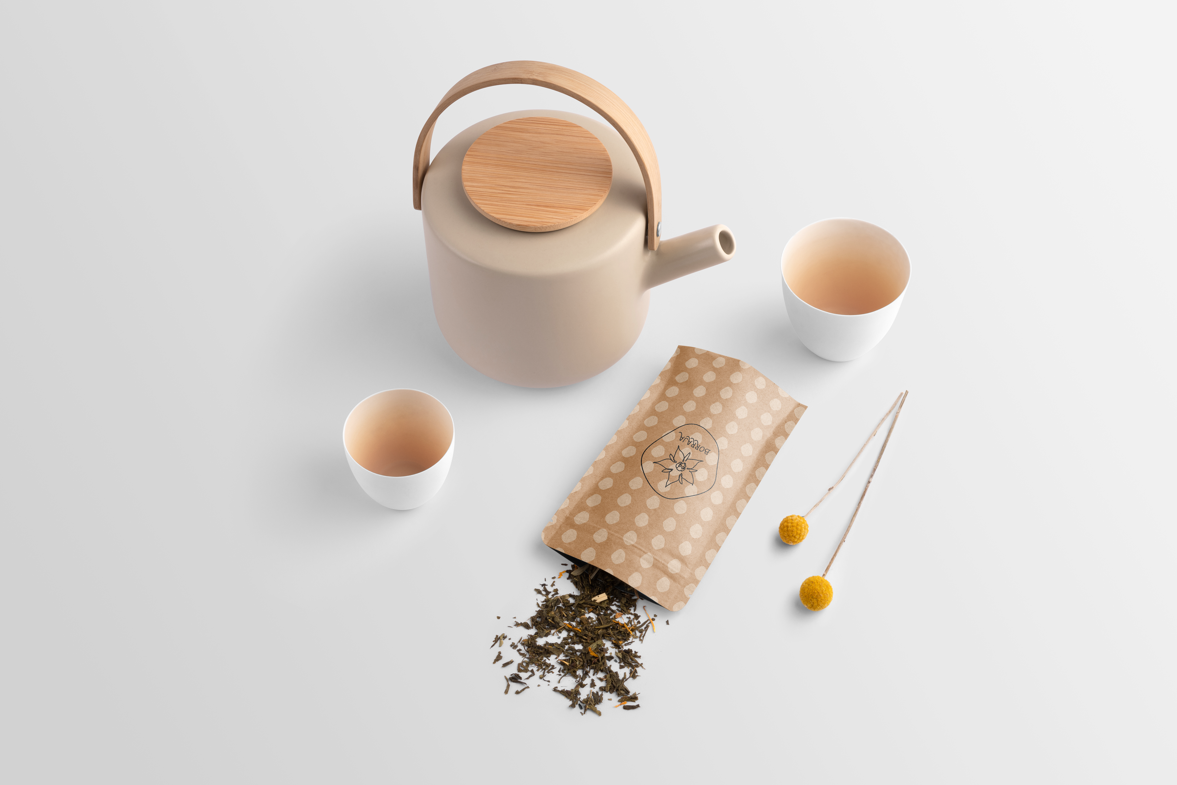
Borraja specializes in teas that include a variety of weeds, focused on the medicinal properties of plants and the benefits of living a slower life and taking the time to reflect and be with your body.
Brand Identity
Becuase this is a new brand that was trying to break into the tea industy, we knew we wanted to create a very cohesive image that included both the name of the brand and a logomark, and that was recognizible and connected to the product itself.
Although currently the brand is focused on tea, their intention is to expand to other uses of medicinal plants in the future.
It's also very important to keep in mind future applications, as the needed to be able to transform this logo into ink stamps, stickers, etc.
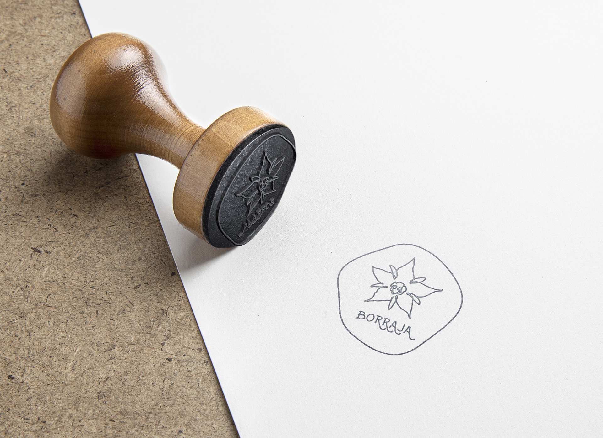
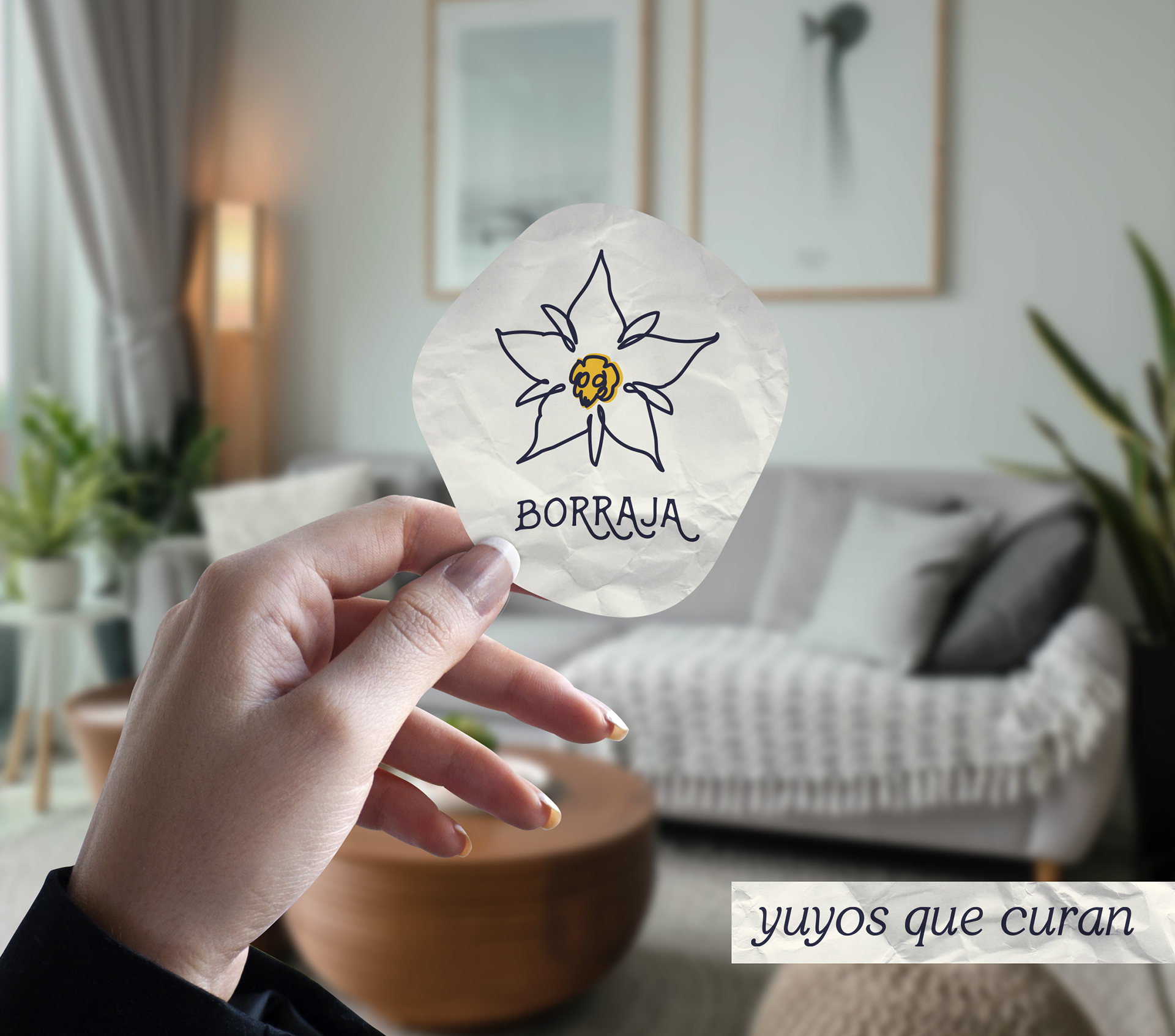
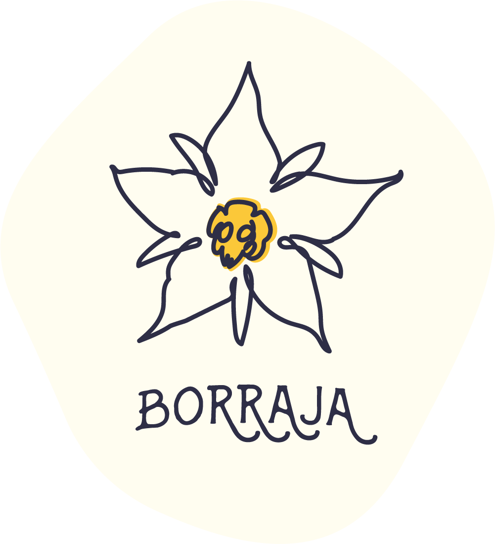
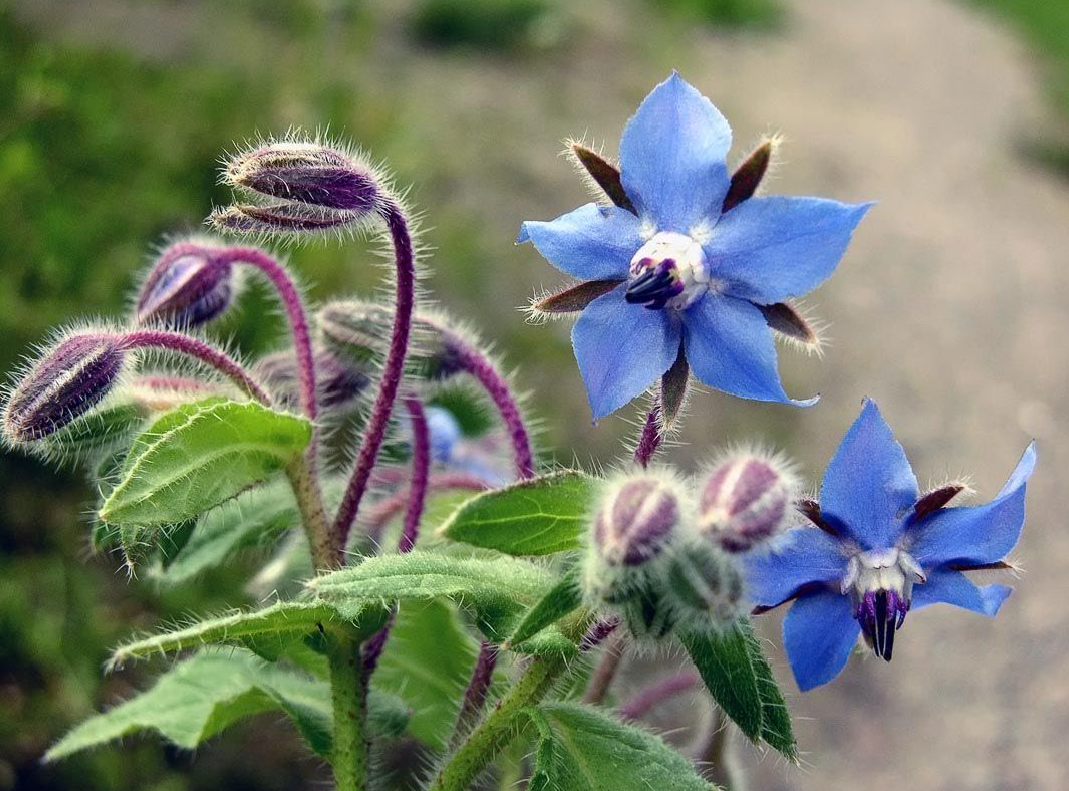
For the logomark, we focused on the name "Borraja" (borage), and extracted the general shape and colors from the plant itself.
We mantained a human, hand-made feel to highlight the encourament to take tea time as a self-care activity and use it as time to reflect, look inwards, and focus on body and mind wellbeing.

For the logotype, we selected the font Swistblnk Banthers, which again has a human feel but also includes modern tails in its glyphs.
We customized the font a bit to better fit the general feel and form of the logo.